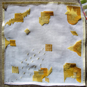
March 4. Although I plan to proceed as randomly as last year, I have a couple of guidelines which I can't articulate until I work a little more.
March 5. Basic units this time are larger than in last year's sample. Not sure if I like it, or if this will continue. The top middle pale square isn't showing up. :-D
March 6. Now there are two pale squares you can't see until I work around them. I'm wondering if I will like this project with far more yellows, compared to the first project in which I used more ivories, taupes, and such.
March 7. Now you can see some of the pale bits.
March 8 & 10.
March 11. I don't turn this to look from all directions as much as I did last year's, which creates a top vs bottom kind of thinking in my head. Lots of fine bits at the top, less fine, "color plane" bits towards the bottom. Not good, but can remedy at this point. I reference the first project a lot and love the limp old-fabric feel of it. And now I've got all ten yellows in.
March 12 & 13. I noticed lately I am putting together yarns close in value, which doesn't bring out the best of the interesting shapes I've managed. Wondering whether to continue this, change direction, or not worry and play it by ear.
March 14 & 15 & 18. Earlier on, I took the first project to bed to look for areas of interest; they were mostly shapes or color combos. These days I take this to bed and it's the last thing I see before I fall asleep. It's lovely to observe how ideas pop up at the last thing at night or first thing in the morning, and how I manage to remember them. (Or, I can't remember what I forgot? More often I remember I had a good idea but can't remember what it was.) It helps also that I twist and turn this in all directions in bed and look at the details while I put this on the floor and look at the big picture during the day. One idea is a paint-splatter pattern; I had thought to experiment with paint first to get more accurate shapes, but I was too lazy. I might change my mind and undo these, but for now they stay. And then Christchurch happened.
March 27.
April 9. I've been immersed in pension paperwork and haven't paid much attention to pretty much anything.
April 10. It takes a while to relearn the characteristics of each color after not working on this for a while.
April 16. Notre Dame burned.
April 17. Already feeling irrepressibly hopeful about Notre Dame, but not about a whole lot else.
April 26. I've been including more of the beige/taupes because the top left corner looks too yellow. But the piece looks so different under natural vs artificial lights. For now I'm calling this "slowly but fun-ly".
April 30. My life this year has been far more sucky than nice/hopeful/uplifting. Am I 1/3 done? It's a slow process but feels slightly quicker than last year.
May 8. I'm still undecided about the ivory splatter pattern, which causes me to not rotate the piece as much as I did last year's, which makes the overall look have more definite orientation. How do I remedy this? Add more splatter to make it go more or less all the way diagonally. Still unsure, intend to add a few more. Then while taking this pic, I see a nasty, smirking cat, and then to realize it's been lurking for a month now. If only you know how much I like cats. (I don't. It's hereditary.)
May 9. Though I like the patchwork-like square and rectangular shapes, I'd like a little more pointy volcanoes for better balance.
May 19. I like the curvy shapes popping up. Last year's project was to mimic collage, so I allowed a lot of straight lines and right angles; this year I've aimed to mix some freehand drawing/painting elements and it appears they are finally emerging.
May 21.The details and sections lose significance when the whole is finished; elements melt into the whole, but also stand out differently from when I'm making them. Because I've managed to work all stitches in the same direction so far, the canvas is hopelessly warped, which makes me think about stitching really big ones.
May 22. Needlepoint and knitting prove I, too, can do "incremental"; I do so enjoy these winter evenings. I wished I could draw this way, but there is still the big mental block, the effort required. I always thought of needlepoint as shapes but last night I started contemplating lines. I have not turned this one around enough as I worked and sometimes the views from the sides surprise/puzzle me.
June 28. I hadn't worked on this for a while, but spent the day yesterday getting back to it. Balancing the different shapes has become the main focus. I will be running out of a few colors soon.
July 1. Balancing/distribution of shapes is now top priority.
July 7. I'm starting to get a little bored and possibly disengaged.
July 10. It pays to stick with it; last couple of nights, nice curves/shapes appeared almost automatically. Phew.
July 11. I am at that stage where I can't wait to finish this, at the same time feeling a smidgen sad about finishing. I also see where this project failed in comparison to last year's, mostly due to my not looking at this from all different angles from the start/constantly.
July 16. I'm now holding my breath, trying hard to finish this, then the pension application, (the last of the backup document arrived today), and hoping and praying I can retread the cotton warp without too much delay and keep weeding; I want to get back to my relative-normal.
July 18. As I wrote yesterday, I've a few things I need to be working on urgently, plus a couple of "always" items, and some knitting I've been dying to start, (and hope to finish?) during this chilly period, but life has been temporarily suspended for this. I have overdone the new-to-me fan shape, but that's what happens when I make things up as I go; the lesson here is, mixing varied shapes/styles require vigilant planning in the distribution/placement department. This actually looks better upside-down; I'll show you when it's finished. I apparently had a bad day mid-July; I've had to take out three shapes I stitched that one night.
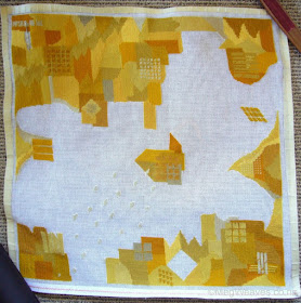
July 20. Finished; this is after hot-cold-hot-cold-hot weaver wash, and repeated steam press. This is the orientation I've been showing you all along. This year I cut off as much of the tape as I could to avoid glue spreading, which left me with really a small margin.
This is the orientation I like. Because I turned the piece around and looked at it from all direction, I didn't have a favorite in last year's piece. If I am to make a piece with a specific purpose, however, I don't know which is the better way to work.
Thoughts:
1) Stitching in uniform direction warps the piece; I may build in changes in direction in the next experiment just for fun.
2) Last year I wanted to emulate collage shapes; this year I wanted to add some drawing/painting effects and I've managed a wider variety of shapes and effect, and I like the pale splatter, although I was completely unsure of it earlier. I had imagined shapes different from its surrounds would stand out, but it appears curves and fluid shapes stand out more than angular/regular shapes? This is worth exploring further.
3) The more variety in shapes/styles, the more distribution/placement planning is needed, whether it is to create harmony, or to contrast interesting/busy bits vs. boring/simpler bits.
4) Last year I had six yellows/oranges, (five in practice; the sixth was disruptive,) and six beige/browns; this year I had ten yellows/oranges and four three beige/browns, plus a place for last year's disruptive member, and proportionately far more skeins of the yellows. This year's is intensely yellow as a result, last year's washed out in comparison, but this year's was
harder to work as I had to constantly compare the colors and a few day's rest required relearning some fine differences all over.
5) I kept referring to last year's sample for various reasons, among them to see if I stitched vertically vs horizontally the difference will wash out in the finishing. I had concluded it had, so in the last week I mixed directions to edit shapes, (i.e. in same colors,) or to create more interesting shapes. At least after one wash, the different appearances did not disappear, so I have unattractive bumps where I edited shapes. As regards the bumps in areas with trickier shapes, though, I find them attractive. Now the question is whether to stick to uniform directions to make each color area smooth, or use basketweave stick, which incidentally makes the reverse side layered/complicated/messy?/interesting.
6) I used dish detergent to wash this year's, while last year I had to wash four times including the third in white spirits to remove the tape glue which had spread all over the piece. Surprisingly I may have washed out more colors this year. Most obvious was with this taupy gray; the left is form last year, the right from this year; the original skein had a slightly yellower/browner appearance much like the left. I was taught this particular dish detergent was the standard for Kiwis washing unwashed/homespun yarns, so I wanted to give it a go, thinking more about the texture of wool rather than dyes. It's harsh on dyes. Because of the repeated washing, last year's piece has a better drape and behaves like a thick wool fabric which I love; this year's still maintains canvas stiffness.
7) The last empty canvas I have is roughly this year's and last year's
put together. I could of course cut it to make two more of these
sizes. A big piece to hang inside the front door in the winter will be
at least six times the size of these sample.
8) Last year's piece took less than three months; this year 4.5, including some long breaks. While I enjoyed this year's experiment just as much, this time was easier in that I could put myself in autodrive once I sat down and picked up the canvas, and the mindless/meditative aspect of making things up as I go was beneficial but also natural.
9) While I have no plans to use this sample, either, I am considering giving this another wash and/or more vinegar baths. I'm trying not to think of next year's plan, but I have a few yellow skeins left.
Good times.


Meg, I really love the way this piece evolved. The gradations of colour are superb. Great stuffb !
ReplyDeleteThank you, Janie. Thank you for your comment.
Delete