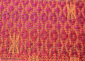
- The various orange stripes show up; yay;
- Both sides look like B-sides, anticipating a more visually stunning A-side. (See pics in the last post). If I weave this in silk, the B-/orange side would have shown the spectacular silk sheen but this is not the case in cotton, at least it's a whole lot less;
- 39EPI yields a meaty, nice heavy feel; I could go 36EPI or 42EPI but 36EPI may reduce the heft while 42EPI will elongate/"skinnify" the pattern which is less attractive. I do like the hand of this fabric;
- The finished cloth has a surprise 3D look, as if the thick 20/2 wefts want to run away and the thin 60/2 wefts are holding them back;
- I feel comfortable about proportion; color and combination/contrasts is another matter; I have to experiment and see before I can decide if something is good or bad, but in the end, I can't sample every single combination so there will always be elements of experimentation/surprise while weaving the "proper" pieces;
- I really don't like the "flecks". I'm definitely going for more harmonious paring, but not too similar the thins weft disappear;
- When weaving, the accents look like rectangular blobs, but on the B-side they come out clearly as an O or an X, and I prefer O in this project;
- Unlike my twills, there isn't enough interaction with the two sides; the A-/B-sides are opposites by nature, I get that, but the warp and weft color distribution feels too radical; I'm not sure if I can be bothered investigating/remedying this aspect in this project/warp, however;
- I sampled five different tie down patterns and the polka dot, and the more bold look seem appropriate rather than the overly fussy ones;
- I'm not sure if I can weave more than 30-40cm on a good day. Because of the colors and the size of the threads, even the thicker threads, I have to be careful and watch out for all kinds of potential errors, including "bubbling" at the selvedges. The width tired me physically, also;
- I must beat hard to position the thick wefts close to each other; beat at the selvedges or somewhere between them and the yellow stripe;
- Depending on the color, threads from the same source and same fiber content full differently, (always a dilemma,) but also the gaps appear better/worse depending on color context. Is there something I can do besides beating the living daylights...?;
- A lot of issues I think of in the first instance are micro elements of the cloth, while the more macro elements, e.g. O vs X or the overall color scheme, are what most folks notice first. I will never forego working out the details of the micro elements to my liking, because they are what I like, but these are things only the maker and long-time user notice. Just reminding myself;
- Initially I planed to weave three standard pieces, but washed/pressed the sample is 69cm wide, which is amenable to a longer length than my standard 210cm without fringes. It's probably wiser to sample to my heart's content, weave two proper pieces, then use up the rest of the warp for a fun fabric as this cloth is also suitable for cutting/sewing experimentation;
- Reed marks remain, but I only put this through a short cold cycle. Warm wash, a longer/additional wash cycle, or use take them out from experience, so I shan't worry;
- Right selvedge was horrible while left was near-perfect while weaving; both are serviceable after washing. Poo-poo;
- Once steam pressed well, it doesn't wrinkle as easily as my 20/2 twill pieces.
3D-ish.
Flecks, which are far more annoying in real life.
O rather than X?
B-side blobs; can you see the top two are backs of Os while the bottom is X? I couldn't while I wove!
Bolder.
So fussy you can't even see the diamond shapes.
Weft float gappiness is worst around "whiter" pattern wefts, not so bad with darker, or wefts more in harmony with the surrounds.On to Sample 2, then.


Loving all the texture and colour in these
ReplyDeleteThank you. However, Tess, I'm not sure if this was a wise project as it's impossible to see everything I need to see while weaving, plus much too wide to weave comfortably. I never learn!
Delete