An hour and a half later, Ben apologized, saying it's in fact roughly 2.4, or 1+square-root-of-2. He was looking at English-language Wiki, where Silver Ratio is the latter, but Japanese Wiki cites both. No need to be able to read Japanese; I understood as much as you might, but the problem is, Ben couldn't find the distinction/definition for the two numbers.
It's not at all unheard of that Japanese translate Japanese terms and concepts into English, or other languages, using words which point to different terms and concepts in English, or other languages; we mean something different but use the words anyway. (I had an example in mind at 1AM this morning, but I can't remember now.) Or maybe there's more in math, but I cannot be bothered; I'm sticking with 1.4.
Why did I want to use this? I've been playing around with Ben's Happi jacket fabric. I bought some cotton cones, 3/12 according to their specs, in five denim colors; these were always going to be for Ben, and he's been asking for a Happi, so Happi it will be.
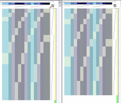
If you look at the two drafts below, which would you consider more Japanese-looking? Do they look different but neither more Japanese than the other?
 Ben and I were amazed at our absolutely preference for the right, a sample of rectangles being elongated using 1.4 vertically, whereas the left sample used Fibonacci sequence, which is roughly the Golden Ratio. We swapped positions of the printed drafts, looked at smaller portions of each, or in different orientations and from different angles, but we chose the Silver Ratio every time.
Fascinating.
11 comments:
Am I in trouble because I like the left one, too?
No, why should you be??
I like them both!
I like the Fibonacci, too, but for other purposes.
I liked the Silver ratio before I read that you wanted our opinion...still like it best.
Interesting. I'm pretty confident the Silver ratio is not a Japanese invention, so I'm not surprised, but pleasantly... pleased.
I have never studied art or geometry so I have zero background. Because of this, I don't understand what makes something look 'Japanese.' I'm mostly Irish/British going back and I don't know what looks Irish. Do nationalities have geometric preferences or tendencies? This puzzles me.
Kind of what I'm trying to do, here; trying to learn what makes something look Japanese, I guess. I do believe there are certain design features that speaks strongly of certain ethnicities. Japanese, in this case. Don't know about anybody else's. But we have a definite aesthetic though the boundaries are always blurred.
I don't know which looks more Japanese than the other, but I think the proportion of the rectangles is more pleasing to my eye in the left sample. I am happy to learn that is the golden ratio in your text. The right sample however has a familiar feel to me, as I am used to things being somewhat "squattier" in my world.
absolutely the one on the right for me! no rhyme or reason...just instinct.
Sunny, going back to your second comment, I don't think I was thinking of preferences based on nationality, but more our perception of "suitability" (i.e. rules?) based either on our ethnic backgrounds or understanding/analysis even of ethnic textiles. At least that's why I'm reading about Japanese aesthetics.
Dana, Golden Ration is, to me, more rhythmic and naturally flowing, whereas I feel Silver is more stable/stilted. They're both good, but if I were to weave this kind of stripes in Golden, I might even try a more scintillating color/s.
Shipbuilding, welcome. Interesting.
Post a Comment